Introducing OAPEN’s new visual identity
Discover a world of open access books: open to all, built to last.
The Hague, 1 October 2025 We’re thrilled to share an exciting new update for OAPEN. Today, we unveil our refreshed visual identity – including a new logo – that better reflects who we’ve become, what we stand for, and where we’re headed.
OAPEN’s look hasn’t changed much - and the logo not at all - since it began as a project in 2008. Therefore, we wanted to create an updated identity that would be both visually appealing and representative of our continued mission: to support the transition to open access for books by serving publishers, libraries, research funders, and researchers, with the ultimate goal of advancing open access for the public good. This rebrand was informed by conversations with our community and internal staff surveys, helping us better understand what people value most about OAPEN and how we can represent this visually.
For several months, we’ve been working with a UI designer and developer who has investigated our services and the public perception of OAPEN to help us shape this new direction. Our updated identity captures the values at the heart of OAPEN: openness, collaboration, and longevity. It’s designed to be clear, welcoming, and forward-looking while continuing to honour the work and community that brought us here.
 |  |
|---|
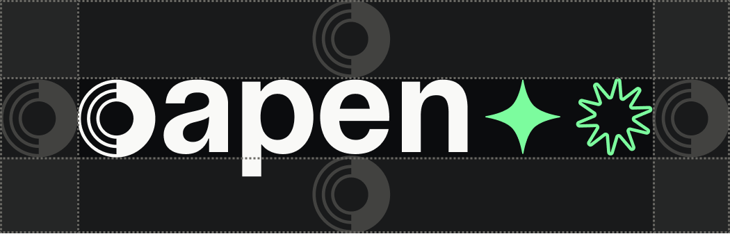
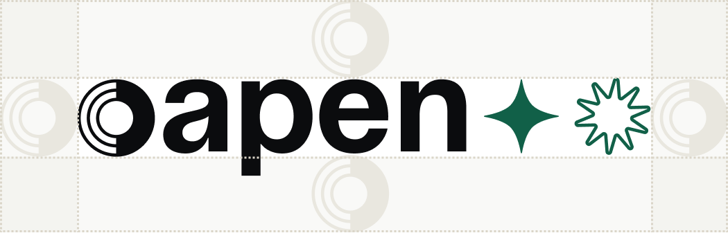
You’ll see new visuals in the logo, throughout the site, and across printed and digital materials. While the imagery was originally drawn from the heritage of manuscripts and early printed books, we’ve heavily reworked and adapted it to better reflect OAPEN’s warmth, dynamism, and global reach. Stars, arrows, and concentric circles suggest unity, continuity, and the movement towards the future of open access books.
| Before | After |
|---|---|
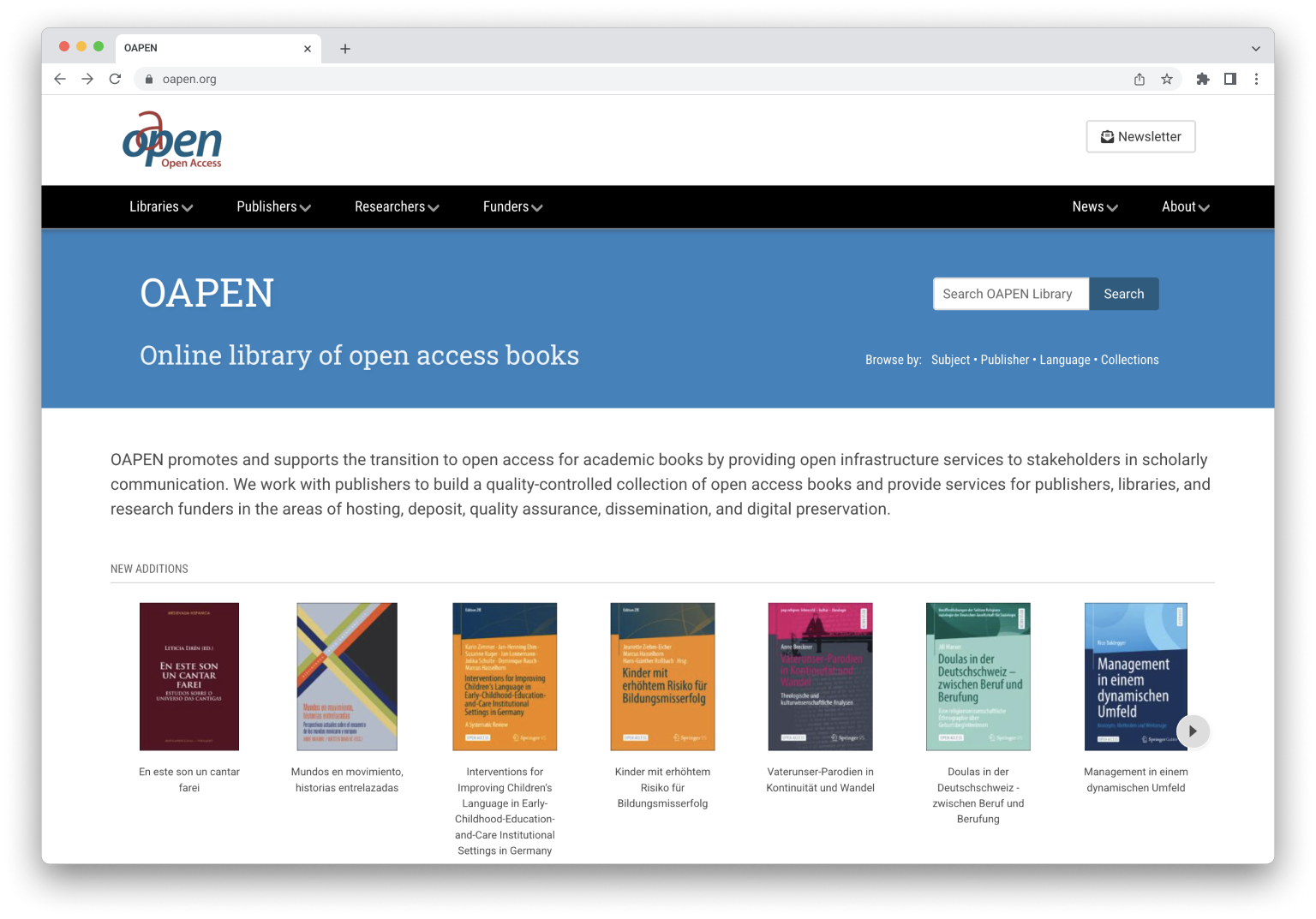 | 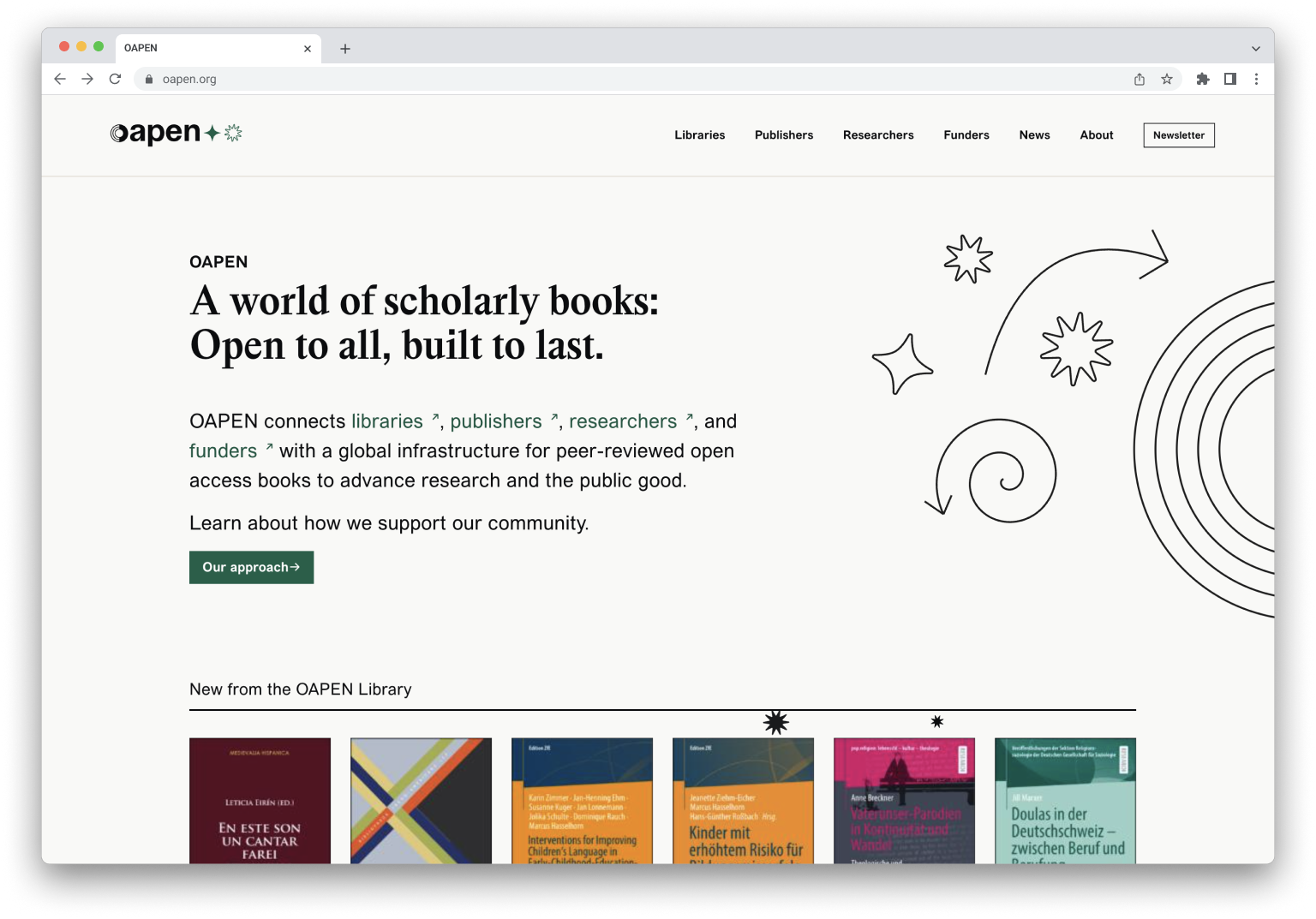 |
The visual transformation will be introduced gradually across OAPEN; there are many elements to consider and we want to ensure a smooth and thoughtful transition. You may notice changes appearing step by step as we align our presence with this new identity. We will also continue to work on the new website accessibility standards in the months to come.
To start with, we updated the main oapen.org website and OAPEN logo, which you’ll become more familiar with as we replace this on our social media channels and in other assets. At a later date, we’ll be incorporating the new design into the OAPEN Library (library.oapen.org) once we complete an upgrade to our DSpace environment, where it is hosted. The Directory of Open Access Books (DOAB) will also be undergoing a visual identity refresh. Stay tuned for updates on our communication channels and directly on DOAB’s website.
This rebrand is more than just a refreshed website or new logo; it’s a renewed commitment to supporting authors, publishers, libraries, and readers worldwide and to communicating OAPEN’s ongoing commitment to bibliodiversity, multilingualism, and democratic global access to knowledge. We invite you to explore our new look and hope you enjoy the changes as much as we do.